Plotting
Now, we will do some basic plots with OOPNET. OOPNET comes with several plotting options:
static plotting based on
matplotlibanimations based on
matplotlibinteractive plots based on
bokeh
First, we will create a static matplotlib plot.
Matplotlib
Static Plotting
First, we declare our imports and read the “C-Town” model:
import os

from matplotlib import pyplot as plt
import oopnet as on

filename = os.path.join('data', 'C-town.inp')

net = on.Network.read(filename)
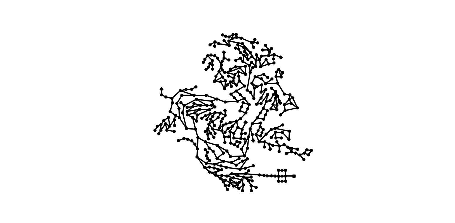
We can now plot the model as-is:
net.plot()
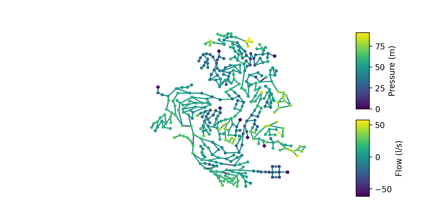
We can also run a simulation and plot the pressure and flow (or any other pandas.Series with link or node IDs as index) by passing them to the nodes and links arguments.
rpt = net.run()
p = rpt.pressure
f = rpt.flow
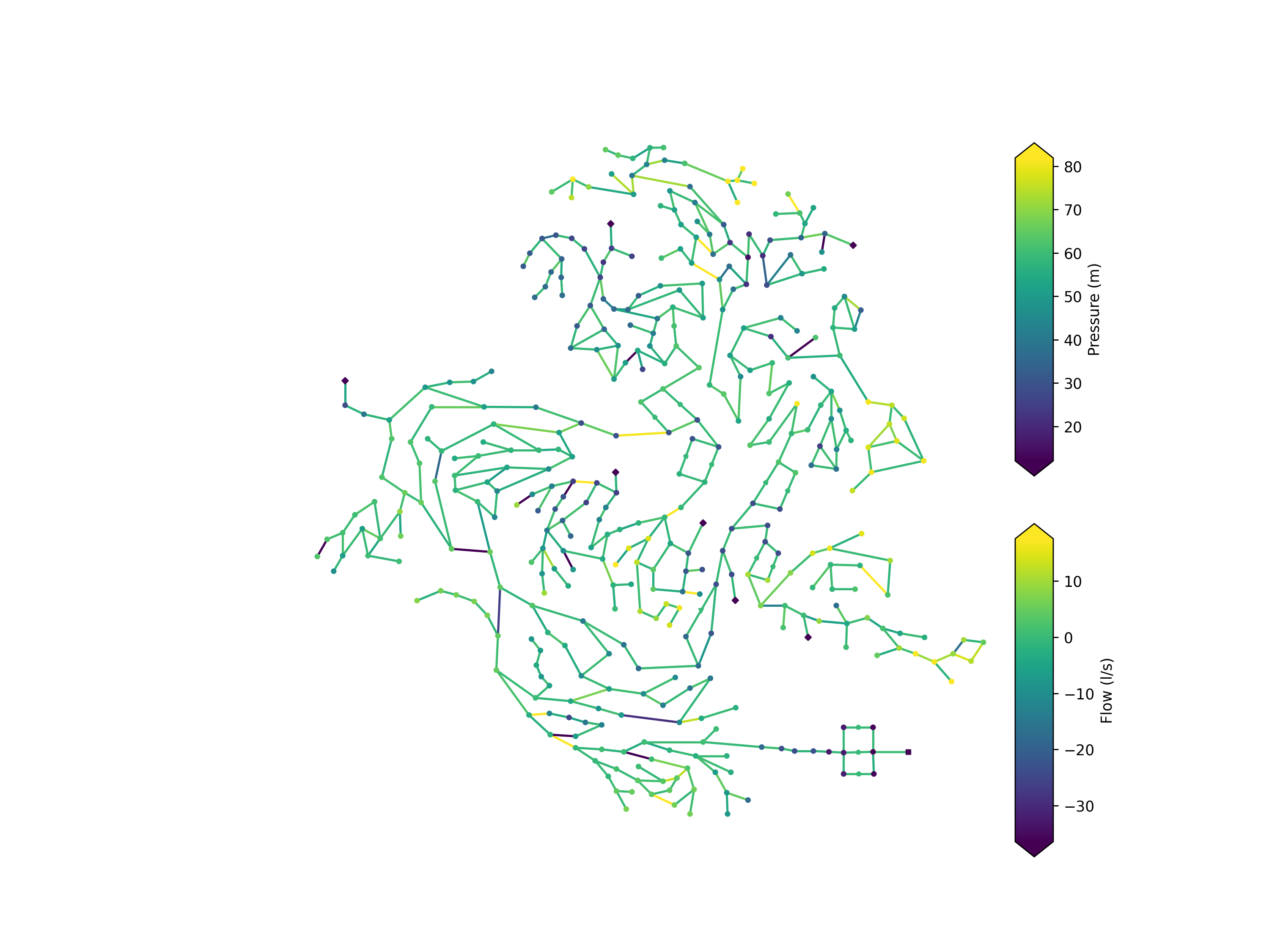
net.plot(nodes=p, links=f)
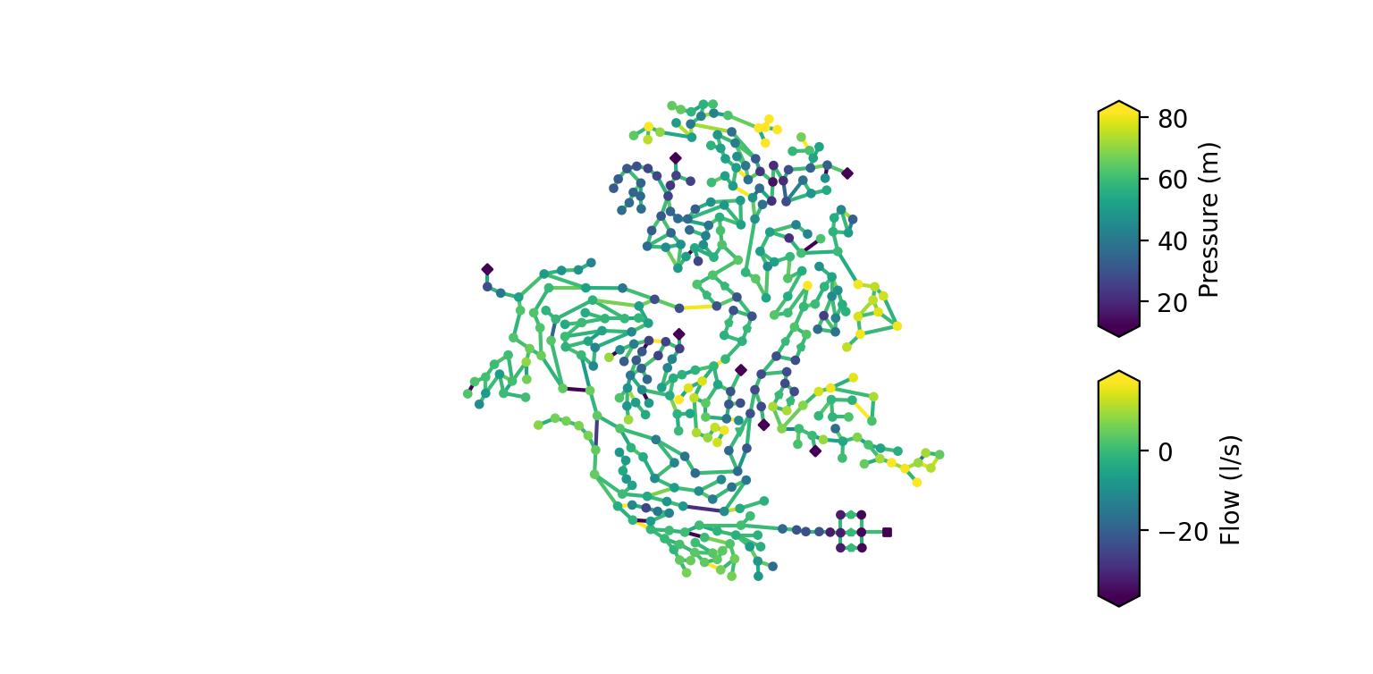
There is also the possibility to limit the color bar to values between the 2nd and 98th percentile using the robust parameter. If it is set to True, the colors in the plot will be more finely graduated because the minima and maxima values will not be used for calculating the value range of the color bar.
net.plot(nodes=p, links=f, robust=True)
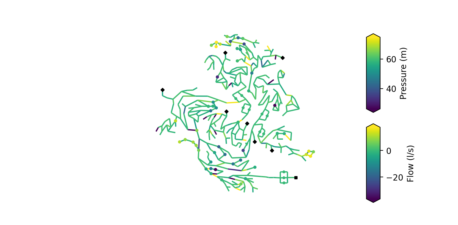
But what if you don’t want to plot all junctions? For instance, if you calculate the difference in pressure between measurement and simulation data, you might not have a value to plot for every junction. By default, if a junction doesn’t have a value assigned, the junction will be plotted in black.
Alternatively, you can prevent OOPNET from plotting junctions without a value assigned and therefore simplify the plot. In this example we only plot the first 50 pressure values from the report by reducing the pressure dataset and passing the truncate_nodes argument to the plotting function:
p_reduced = p.iloc[:50]
net.plot(nodes=p_reduced, links=f, robust=True, truncate_nodes=True)
You can also pass values for the link width in the plot. Here, we use this to show the diameters in the network while hiding all the nodes.
diameters = on.get_diameter(net)
net.plot(linkwidth=diameters, markersize=0)

The figure can also be customized by using the ax argument. For instance, here we create a plot with a certain size and DPI count:
fig, ax = plt.subplots(figsize=(12, 9), dpi=250)
net.plot(ax=ax, nodes=p, links=f, robust=True)
Don’t forget to show the plots:
plt.show()
Plotting Animations
In this example we want to create a matplotlib animation of the model where we plot the flow and pressure results from an extended period simulation.
For this, we first have to import the packages we require:
osfor specifying the path to the EPANET input filematplotlib.pyplotfor creating an animation of a certain sizematplotlib.animation.PillowWriterfor writing the animation to a fileand of course
oopnetitself
In this example we read a part of the L-Town network (Area C) with slight modifications. This model already comes with included patterns and can be used for extended period simulations.
import os

from matplotlib import pyplot as plt
from matplotlib.animation import PillowWriter

import oopnet as on

filename = os.path.join('data', 'L-TOWN_AreaC.inp')
net = on.Network.read(filename)
Then, we can simulate the model with its .run() method and save the simulation results to the variable rpt.
rpt = net.run()
If we want to take a closer look at the simulation results, we can access the report’s different properties. Since we want to use the flow and pressure data in the animation, we assign them to variables. We also limit the data to a single day and take a look at a few data points.
p = rpt.pressure.loc['2016-01-01']
f = rpt.flow.loc['2016-01-01']
print(p)
print(f)
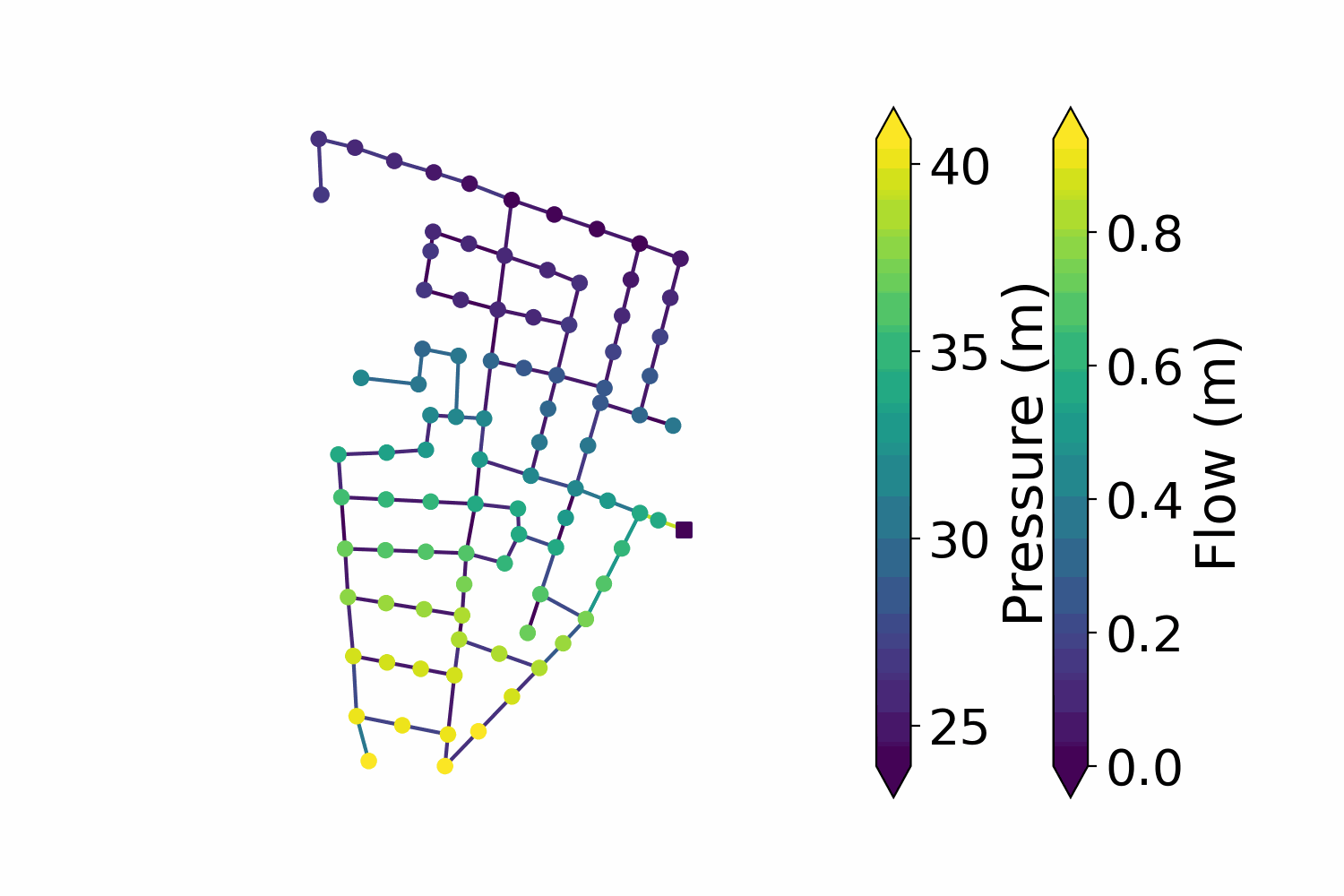
Now, we create an animation using the Network’s .animate() method. First, we create matplotlib Figure and Axes objects and pass a desired figure size:
fig, ax = plt.subplots(figsize=(7.5, 5))
We then pass the ax object to the animate method along with the simulation data. We call the flow data’s .abs() method, to use the absolute flow values in the animation. The labels for the node and link color bars have to be passed as well. You can also specify how long the interval between the reporting time steps should be. The model uses a reporting time step of 5 minutes, so we choose an interval of 50 ms. The robust argument limits the color bar to values between the 2nd and the 98th percentile of the passed data’s value range.
anim = net.animate(ax=ax, nodes=p, links=f.abs(), node_label="Pressure (m)", link_label="Flow (m)", robust=True, interval=50)
Finally, we can save the animation. Using the dpi and fps attributes helps you control the animation quality and file size:
anim.save("simple_animation.gif", dpi=200, writer=PillowWriter(fps=20))
Bokeh
Now, we will create an interactive plot using bokeh. Let’s start with our imports and model reading (we will use the “C-Town” model):
import os

from bokeh.plotting import output_file, show
import oopnet as on

filename = os.path.join('data', 'C-town.inp')
net = on.Network.read(filename)
Next, we simulate the model and get the pressure and flow results for our plot:
rpt = net.run()
p = rpt.pressure
f = rpt.flow
Bokeh creates a HTML file that will be locally stored on your device. This file will contain our plot. We can set the file name using bokeh.plotting.output_file():
output_file('bokehexample.html')
Finally, we create and show the plot:
plot = net.bokehplot(nodes=p, links=f, colormap=dict(node='viridis', link='cool'))
show(plot)
Summary
Static Matplotlib Plotting
import os

from matplotlib import pyplot as plt
import oopnet as on

filename = os.path.join('data', 'C-town.inp')

net = on.Network.read(filename)

net.plot()

rpt = net.run()
p = rpt.pressure
f = rpt.flow

net.plot(nodes=p, links=f)
net.plot(nodes=p, links=f, robust=True)

p_reduced = p.iloc[:50]
net.plot(nodes=p_reduced, links=f, robust=True, truncate_nodes=True)

diameters = on.get_diameter(net)
net.plot(linkwidth=diameters, markersize=0)

fig, ax = plt.subplots(figsize=(12, 9), dpi=250)
net.plot(ax=ax, nodes=p, links=f, robust=True)

plt.show()
Animated Matplotlib Plotting
import os

from matplotlib import pyplot as plt
from matplotlib.animation import PillowWriter

import oopnet as on

filename = os.path.join('data', 'L-TOWN_AreaC.inp')
net = on.Network.read(filename)

rpt = net.run()

p = rpt.pressure.loc['2016-01-01']
f = rpt.flow.loc['2016-01-01']
print(p)
print(f)

fig, ax = plt.subplots(figsize=(7.5, 5))
anim = net.animate(ax=ax, nodes=p, links=f.abs(), node_label="Pressure (m)", link_label="Flow (m)", robust=True, interval=50)
anim.save("simple_animation.gif", dpi=200, writer=PillowWriter(fps=20))
Interactive Bokeh Plot
import os

from bokeh.plotting import output_file, show
import oopnet as on

filename = os.path.join('data', 'C-town.inp')
net = on.Network.read(filename)

rpt = net.run()
p = rpt.pressure
f = rpt.flow

output_file('bokehexample.html')
plot = net.bokehplot(nodes=p, links=f, colormap=dict(node='viridis', link='cool'))
show(plot)